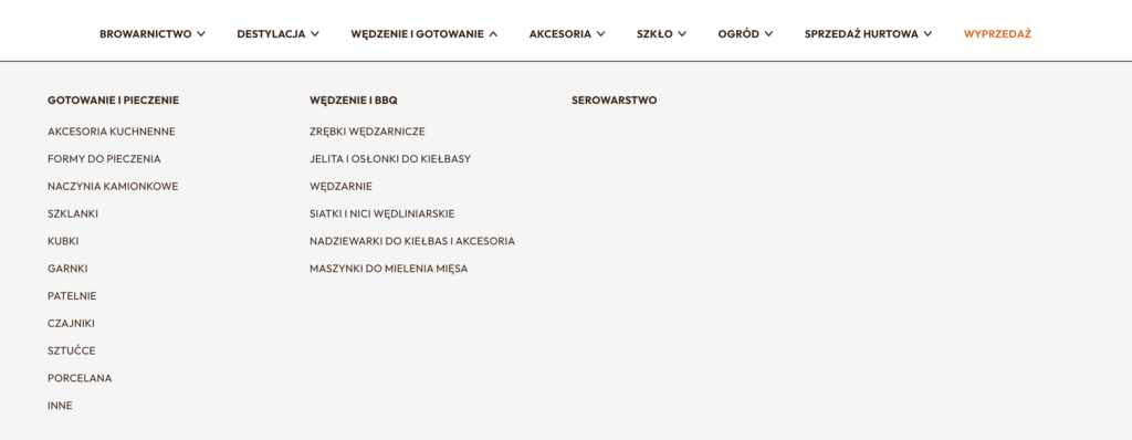



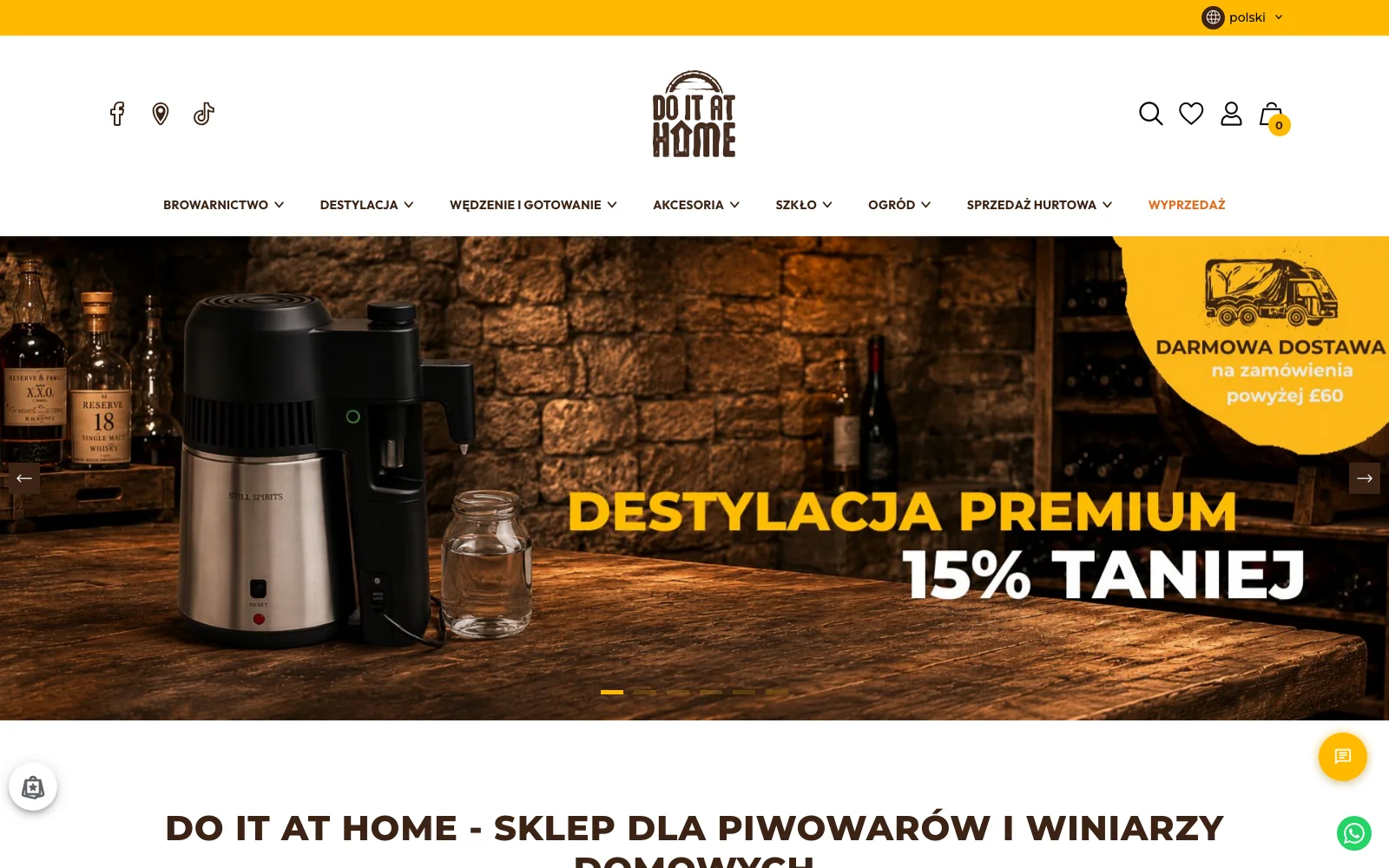
We built a drop-down menu presenting the full offer on three levels, with a visual division into sections, so customers can find their way around the catalogue from the first click.
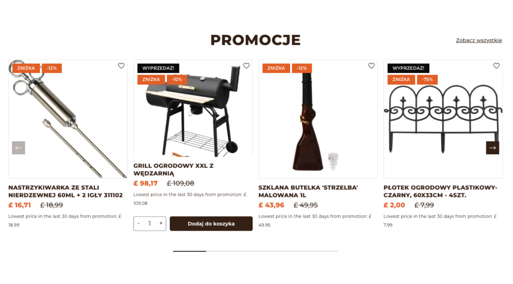
Do It At Home
A store for the UK market after a rebrand with click and collect restricted by postcode
For the Do It At Home brand we built a store for the United Kingdom market: with a three-level menu guiding customers through a wide catalogue, in-store pickup verified by postcode and full ERP integration.
Do It At Home has been operating in the United Kingdom since 2015. It supplies products and tools for cooking enthusiasts and home brewing and distilling.
A wide offer and many categories made it hard for customers to find products, and unclear navigation discouraged further browsing.
A large share of traffic comes from phones, so the store had to work comfortably at every resolution.
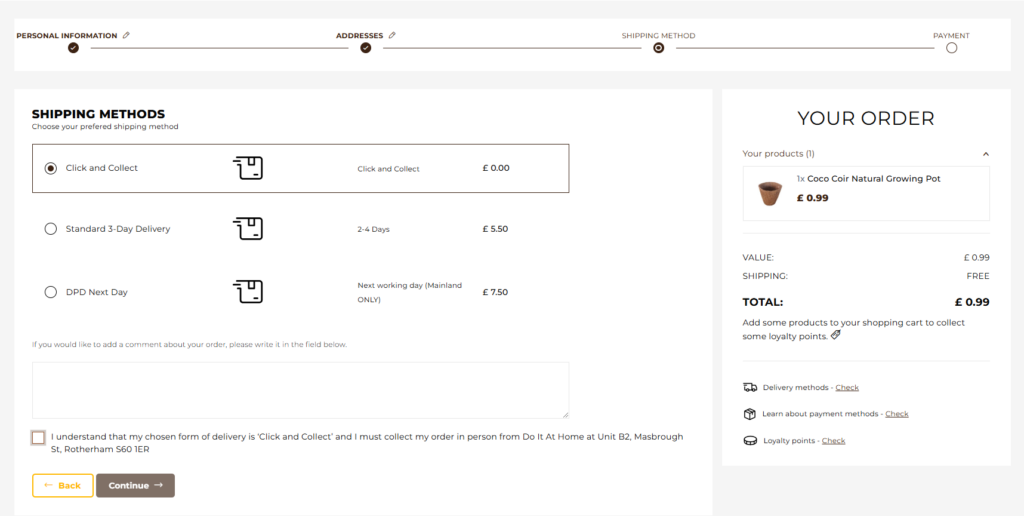
Orders for in-store pickup were placed by customers from outside the store's area, which ended in uncollected parcels.
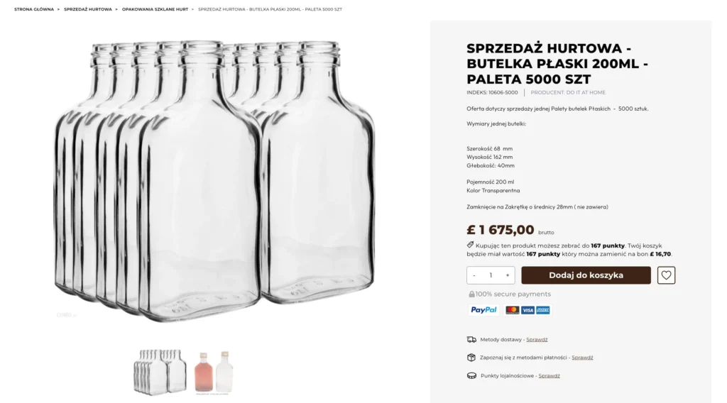
The product page was to clearly show delivery and payment terms and hold extended descriptions with photos and video.
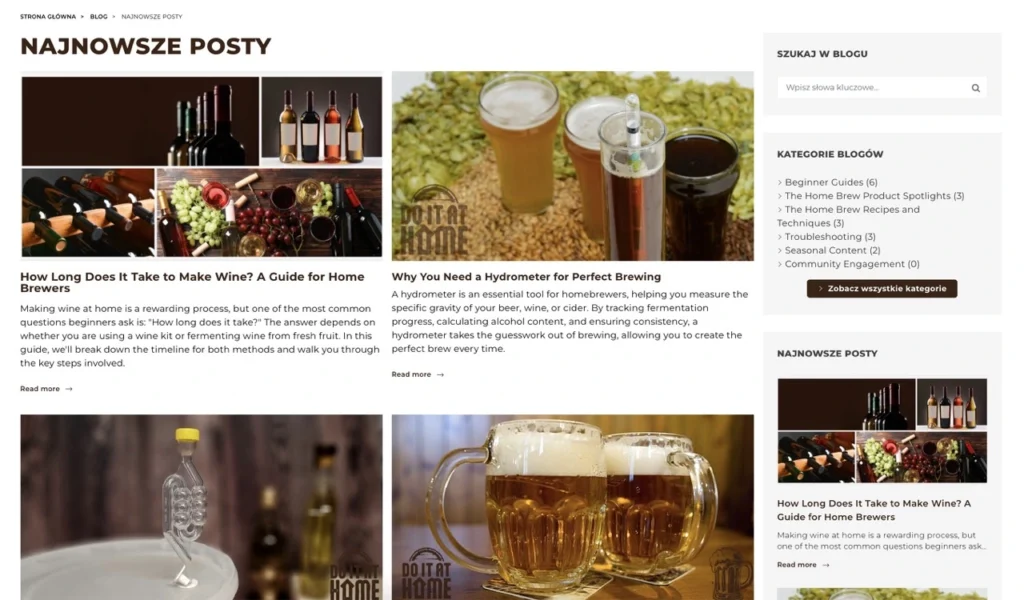
The brand was planning intensive SEO work: optimising product pages and categories and launching a blog.
The rebrand required carrying the new identity over to the store and email communication.
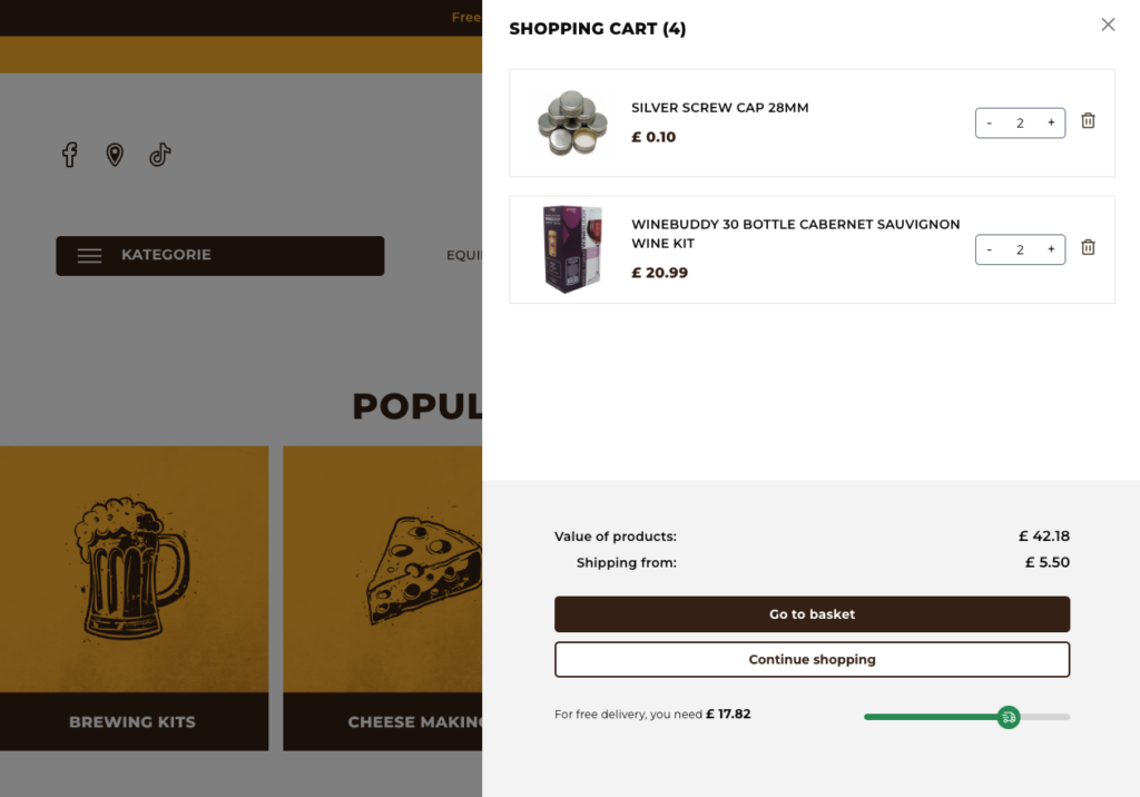
Stock, prices and orders were to update in real time, without manual data transfer.
Six project areas, from navigation to ERP integration. Expand to see the details.
We built a drop-down menu presenting the full offer on three levels, with a visual division into sections, so customers can find their way around the catalogue from the first click.
The new design is consistent with the refreshed brand identity and adapted to mobile devices.
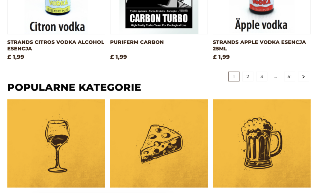
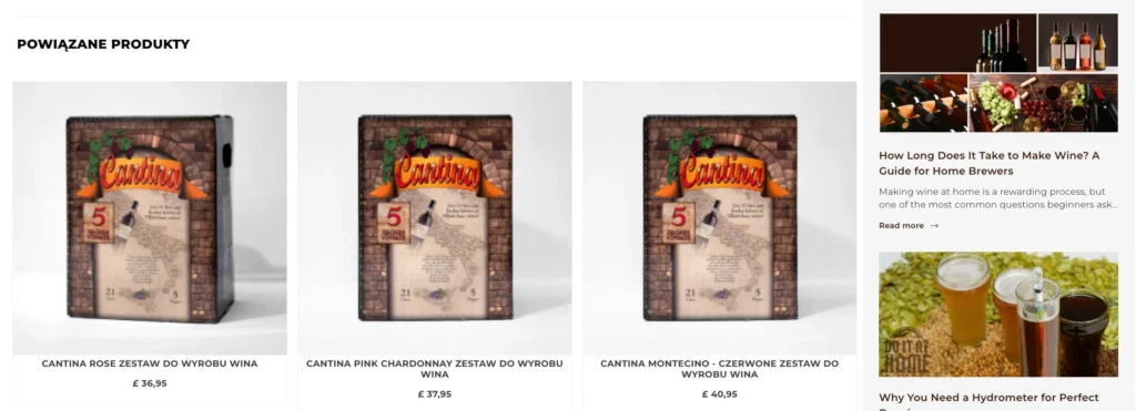
Product descriptions can be enriched with photos and video, and product carousels show related items and new arrivals.
SEO modules made it possible to extend categories with descriptions and redirects based on long-tail phrases, and the blog provided space for content that attracts traffic.
The store layout and transactional emails speak one visual language, which rounds off the impression after placing an order.
Full ERP integration synchronised stock, prices and orders, so the offer in the store reflects what is really in the warehouse.
Do It At Home sells on the UK market in a store that is easy to navigate despite a wide catalogue. In-store pickup is limited to customers from the area, so uncollected orders no longer burden customer service, and the ERP integration removed the need to watch stock manually.
Postcode verification at click and collect filters out orders that nobody will come to pick up.
Need more examples? See our projects for food and home brands.
We run FMCG shops where finding products quickly, repeat baskets and on-time delivery matter. See what we implement in this industry.
Want to know what our PrestaShop solutions can do for your shop? Fill in the form and we’ll get in touch to learn about your business needs. We’ll prepare an initial analysis and a proposed plan of action.
We reply within 24 working hours.